What you'll learn
This codelab will focus on customizing the Blockly toolbox.
In this codelab you will learn:
- How to add a background color to a toolbox category.
- How to change the look of a selected category.
- How to add a custom CSS classes to a toolbox category.
- How to change the structure of your category HTML.
- How to add a custom toolbox item.
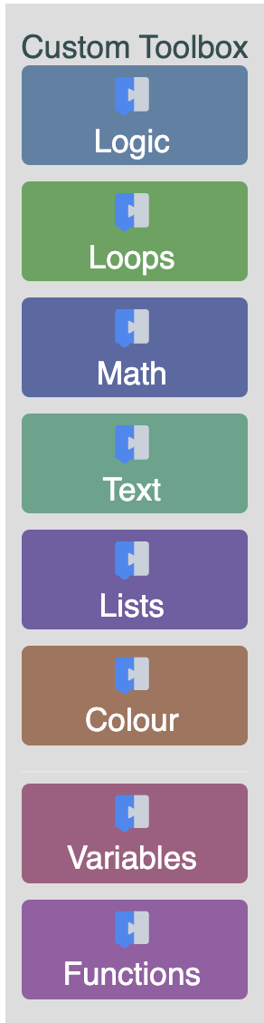
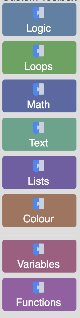
What you'll build
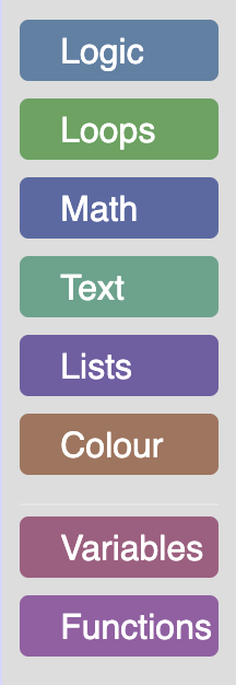
Over the course of this codelab you will customize your toolbox categories as well as create a custom toolbox item. The resulting toolbox is shown below.
The code samples are written in ES6 syntax. You can find the code for the completed custom toolbox on GitHub.
What you'll need
- A browser.
- A text editor.
- Basic knowledge of HTML, CSS, and JavaScript.
- Basic understanding of the Blockly toolbox.
Throughout various parts of this codelab we will be talking about toolbox definitions. The toolbox definition can be written in XML or JSON. We will be using an XML toolbox definition that can be found in the provided code.
Download the sample code
You can get the sample code for this codelab by either downloading the zip here:
or by cloning this git repo:
git clone https://github.com/google/blockly-samples.git
If you downloaded the source as a zip, unpacking it should give you a root folder named blockly-samples-master.
The relevant files are in examples/custom-toolbox-codelab. There are two versions of the app:
starter-code/: The starter code that you'll build upon in this codelab.complete-code/: The code after completing the codelab, in case you get lost or want to compare to your version.
Each folder contains:
index.js- The codelab's logic. To start, it just injects a simple workspace.index.html- A web page containing a simple blockly workspace.
To run the code, simply open starter-code/index.html in a browser. You should see a Blockly workspace with a toolbox.
Define and register a custom category
To start, create a file named custom_category.js in the starter-code directory. Include your new file by adding a script tag to index.html.
<script src="custom_category.js"></script>
In order to create a custom category we will create a new category that extends the default Blockly.ToolboxCategory class. Add the following code to your custom_category.js file.
class CustomCategory extends Blockly.ToolboxCategory {
  /**
   * Constructor for a custom category.
   * @override
   */
  constructor(categoryDef, toolbox, opt_parent) {
    super(categoryDef, toolbox, opt_parent);
  }
}
After defining your category you need to tell Blockly that it exists. Register your category by adding the below code to the end of custom_category.js.
Blockly.registry.register(
    Blockly.registry.Type.TOOLBOX_ITEM,
    Blockly.ToolboxCategory.registrationName,
    CustomCategory, true);
By registering our CustomCategory with Blockly.ToolboxCategory.registrationName we are overriding the default category in Blockly. Because we are overriding a toolbox item instead of adding a new one, we must pass in true as the last argument. If this flag is false, Blockly.registry.register will throw an error because we are overriding an existing class.
The result
To test, open index.html in a browser. Your toolbox should look the same as it did before.
However, if you run the below commands in your console you will see that your toolbox is now using the CustomCategory class.
var toolbox = Blockly.common.getMainWorkspace().getToolbox();
toolbox.getToolboxItems()[0];
Change the background of the category
In the default ToolboxCategory class, the addColourBorder_ method adds a strip of color next to the category name. We can override this method in order to add colour to the entire category div.
Add the following code to your CustomCategory class.
/** @override */
addColourBorder_(colour){
  this.rowDiv_.style.backgroundColor = colour;
}
The colour passed in is calculated from either the categorystyle or the colour attribute set on the category definition.
For example, the "Logic" category definition looks like:
<category name="Logic" categorystyle="logic_category">
...
</category>
The logic_category style looks like:
"logic_category": {
    "colour": "210"
  }
For more information on Blockly styles please visit the themes documentation.
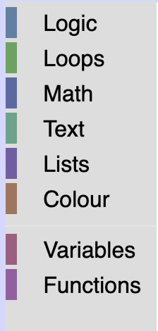
Add some CSS
Open index.html to see your updated toolbox. Your toolbox should look similar to the below toolbox.
We are going to add some CSS to make it easier to read, and to space out our categories.
Create a file named toolbox_style.css in the same directory as index.html and include it in index.html:
<link rel="stylesheet" href="toolbox_style.css">
Copy and paste the following CSS into your toolbox_style.css file.
/* Makes our label white. */
.blocklyToolboxCategoryLabel {
  color: white;
}
/* Adds padding around the group of categories and separators. */
.blocklyToolboxContents {
  padding: 0.5em;
}
/* Adds space between the categories, rounds the corners and adds space around the label. */
.blocklyToolboxCategory {
  padding: 3px;
  margin-bottom: 0.5em;
  border-radius: 4px;
}
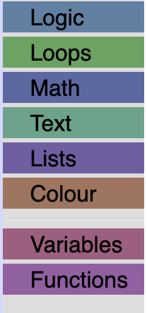
The result
Open index.html to see your toolbox.
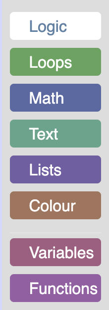
Open your index.html and click on a category. You will see that it doesn't give any indication that it has been clicked. Worse than that, if you click on the category a second time the background color will disappear.
To fix this, we are going to override the setSelected method to change the look of a category when it has been clicked. In the default category class this method adds a colour to the entire row when a category is selected. Since we have already expanded the colour over our entire div, we are going to change the background color of the div to white, and the text to the color of the category when it has been selected.
Add the following code to custom_category.js:
/** @override */
setSelected(isSelected){
   // We do not store the label span on the category, so use getElementsByClassName.
   var labelDom = this.rowDiv_.getElementsByClassName('blocklyToolboxCategoryLabel')[0];
   if (isSelected) {
     // Change the background color of the div to white.
     this.rowDiv_.style.backgroundColor = 'white';
     // Set the colour of the text to the colour of the category.
     labelDom.style.color = this.colour_;
   } else {
     // Set the background back to the original colour.
     this.rowDiv_.style.backgroundColor = this.colour_;
     // Set the text back to white.
     labelDom.style.color = 'white';
   }
   // This is used for accessibility purposes.
   Blockly.utils.aria.setState(/** @type {!Element} */ (this.htmlDiv_),
       Blockly.utils.aria.State.SELECTED, isSelected);
}
The result
Open index.html and click on the "Logic" category. You should now see a white category with a colored label.
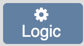
We are going to add an icon to our "Logic" category by adding an icon library to our index.html file, and setting the appropriate CSS class on our category definition.
To start, we are going to grab an icon library and add it to index.html:
<link rel="stylesheet" href="https://cdnjs.cloudflare.com/ajax/libs/font-awesome/4.7.0/css/font-awesome.min.css">
We are going to add a cog icon from this library to the "Logic" category. To do this, we will add the appropriate CSS classes to our category definition.
In index.html scroll down to your toolbox definition and change the below line:
<category name="Logic" categorystyle="logic_category">
to be:
<category css-icon="customIcon fa fa-cog" name="Logic" categorystyle="logic_category">
All the classes used to create a category can be set similar to how we set the icon class above. See the Blockly toolbox documentation for more information.
Add some CSS
If you open index.html you will notice that the gear icon is positioned incorrectly and is a bit difficult to see. We will use the customIcon class to change the color of the icon and use the blocklyTreeRowContentContainer class to position the icon above the text.
In your toolbox_style.css file add:
/* Changes color of the icon to white. */
.customIcon {
  color: white;
}
/* Stacks the icon on top of the label. */
.blocklyTreeRowContentContainer {
  display: flex;
  flex-direction: column;
  align-items: center;
}
.blocklyToolboxCategory {
  height: initial;
}
Update setSelected
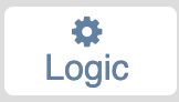
If you open index.html and click on the "Logic" category you will notice that the white icon now blends into the white background.
In order to fix this, we are going to update our setSelected method to set the color of the icon to the category color when the category has been selected.
Inside custom_category.js add the below line to setSelected if the category has been selected:
this.iconDom_.style.color = this.colour_;
Add the below line to setSelected if the category has not been selected:
this.iconDom_.style.color = 'white';
Your setSelected method should look similar to below:
  /** @override */
  setSelected(isSelected){
     // We do not store the label span on the category, so use getElementsByClassName.
     var labelDom = this.rowDiv_.getElementsByClassName('blocklyToolboxCategoryLabel')[0];
     if (isSelected) {
       // Change the background color of the div to white.
       this.rowDiv_.style.backgroundColor = 'white';
       // Set the colour of the text to the colour of the category.
       labelDom.style.color = this.colour_;
       this.iconDom_.style.color = this.colour_;
     } else {
       // Set the background back to the original colour.
       this.rowDiv_.style.backgroundColor = this.colour_;
       // Set the text back to white.
       labelDom.style.color = 'white';
       this.iconDom_.style.color = 'white';
     }
     // This is used for accessibility purposes.
     Blockly.utils.aria.setState(/** @type {!Element} */ (this.htmlDiv_),
         Blockly.utils.aria.State.SELECTED, isSelected);
  }
The result
If you open your index.html file, you should see a white gear above your "Logic" label, and it should change to blue when the category has been selected.
If you only need to change the CSS, like we did in the previous section, then using the cssConfig is a great choice. However, if you need to change the html, maybe to add text, an image, or anything else, you can override the corresponding method that creates the dom. In this example, we'll add an createIconDom_ method.
Change the element for our icon
By default, the createIconDom_ method adds a element for the category icon. We can override this to return an
Add the following methods to custom_category.js:
/** @override */
createIconDom_() {
  const img = document.createElement('img');
  img.src = './logo_only.svg';
  img.alt = 'Lamp';
  img.width='15';
  img.height='15';
  return img;
}
The result
If you open index.html you should now see the blockly logo on top of all your categories
In the previous sections we modified the toolbox by extending the base category class. In this section we will make a completely new toolbox item and add it to our toolbox.
For this example, we are going to create a toolbox label.
Setup
In the same directory as index.html create a new file named toolbox_label.js.
Include this file in index.html:
<script src="toolbox_label.js"></script>
Create a class in toolbox_label.js that extends Blockly.ToolboxItem and register it.
class ToolboxLabel extends Blockly.ToolboxItem {
  constructor(toolboxItemDef, parentToolbox) {
    super(toolboxItemDef, parentToolbox);
  }
}

Blockly.registry.register(
    Blockly.registry.Type.TOOLBOX_ITEM,
    'toolboxlabel',
    ToolboxLabel);
By registering this toolbox item with the name "toolboxlabel" we can now use this name in our toolbox definition to add our custom item to the toolbox.
Navigate to index.html, and scroll down to the toolbox definition. Add a
<toolboxlabel></toolboxlabel>
Your toolbox definition should now look something like:
<xml xmlns="https://developers.google.com/blockly/xml" id="toolbox-categories" style="display: none">
<toolboxlabel></toolboxlabel>
<category css-icon="customIcon fa fa-cog" name="Logic" categorystyle="logic_category">
...
</xml>
Initialize the toolbox item
In order to create a toolbox item we must implement one of the toolbox item interfaces.
For this example, we will be implementing the basic IToolboxItem interface. There are three different types of toolbox item interfaces: IToolboxItem, ISelectableToobloxItem and ICollapsibleToolboxItem. Since we do not need our label to be selectable or collapsible, we can implement the basic IToolboxItem interface.
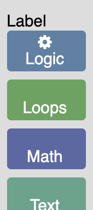
First, we are going to add an init method that will create the dom for our toolbox label:
  /** @override */
  init() {
    // Create the label.
    this.label = document.createElement('label');
    // Set the name.
    this.label.textContent = 'Label';
  }
Next, we are going to return this element:
  /** @override */
  getDiv() {
    return this.label;
  }
If you open the index.html file you should see a label above your first category.
Add attributes to the toolbox definition
The above code is rather limiting since it only allows us to create a toolbox label with the text "Label". To make it possible to create different labels with different text and colour we are going to add name and colour attributes to our toolbox definition.
Open index.html and navigate to the toolbox definition. Change your toolboxlabel element to look like the below line:
<toolboxlabel name="Custom Toolbox" colour="darkslategrey"></toolboxlabel>
These values will get passed in to our ToolboxLabel class through the toolboxItemDef. Navigate to toolbox_label.js and add the following lines to your init method:
// Set the name.
this.label.textContent = this.toolboxItemDef_['name'];
// Set the color.
this.label.style.color = this.toolboxItemDef_['colour'];
Remove the following line from your init method:
this.label.textContent = 'Label';
All attributes on our toolbox definition get added to the toolboxItemDef_. this.toolboxItemDef_ is set in the Blockly.ToolboxItem constructor.
Open your index.html in a browser to see the updated label.
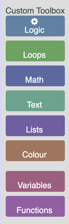
Add some CSS
Similar to how we added colour and name above, we are going to add a custom class to our label.
Navigate to your toolbox definition in index.html and modify it to look like the below line.
<toolboxlabel name="Label" colour="darkslategrey" css-label="customLabel"></toolboxlabel>
Any item that begins with css- will be added to a cssconfig object stored on the toolboxItemDef.
To use this value navigate to toolbox_label.js and add the following lines to your init method.
// Any attributes that begin with css- will get added to a cssconfig object.
const cssConfig = this.toolboxItemDef_['cssconfig'];
// Add the class.
if (cssConfig) {
  this.label.classList.add(cssConfig['label']);
}
The above code will add the class to the label. Now, in toolbox_style.css add the below CSS to make the label bold.
.customLabel {
   font-weight: bold;
}
The result
If you open index.html you should now see a bold dark gray label at the top of your toolbox.
The toolbox can be customized in a variety of ways to make it work for your application. In this codelab you learned:
- How to create a custom category.
- What method to override to change how the colour of the category is applied.
- What method to override to change the look of the category when selected.
- How to add an icon by adding a custom CSS class to the icon div.
- How to change what HTML Elements are used for different parts of a category.
- How to create a custom toolbox item. You can find the code for the completed custom toolbox on GitHub.